Saturday, June 9, 2018

Introduction to iOS Development Series 1.8 - Compose a Complete App with Button and Label

Wth the basic knowledge of iOS development that we have accumulated so far. We can compose a complete app. So let's get started.


Create Project and Place Visual Objects

First we create another project as Intro7.


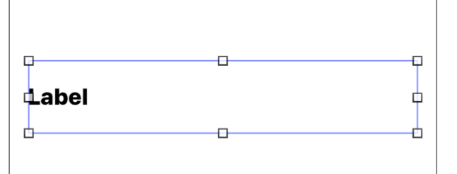
Next, we place a label at the top half of the storyboard canvas. Extend the label to almost the edge of the canvas. There should be dotted lines guiding us.


The attributes of label should be as follows:


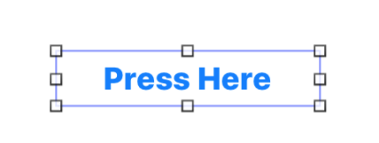
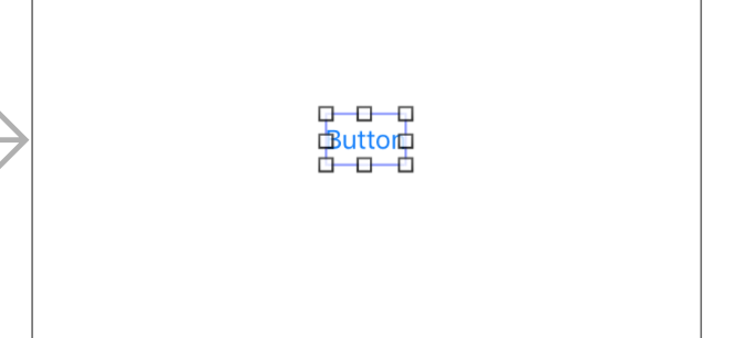
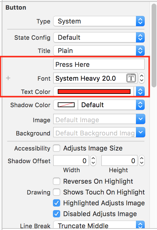
Next we place a button at the center. Expand out the button a bit.


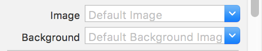
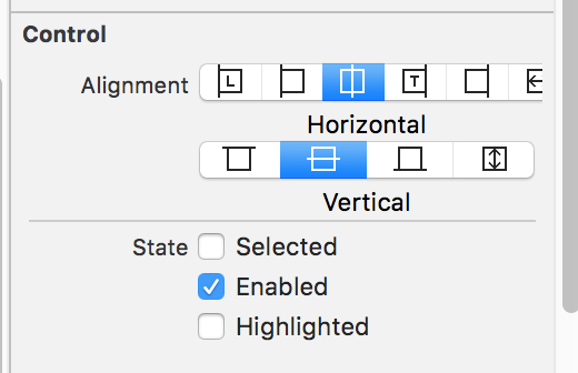
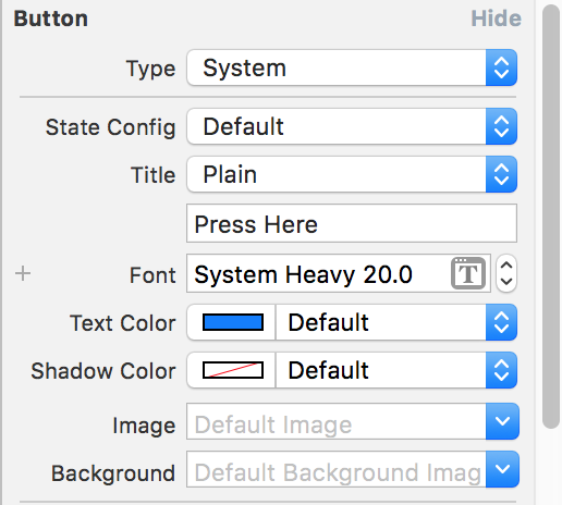
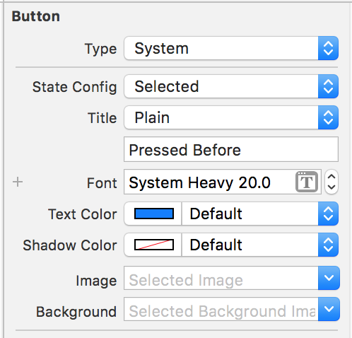
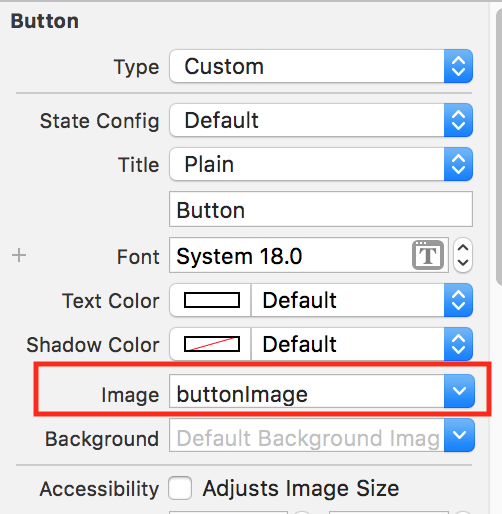
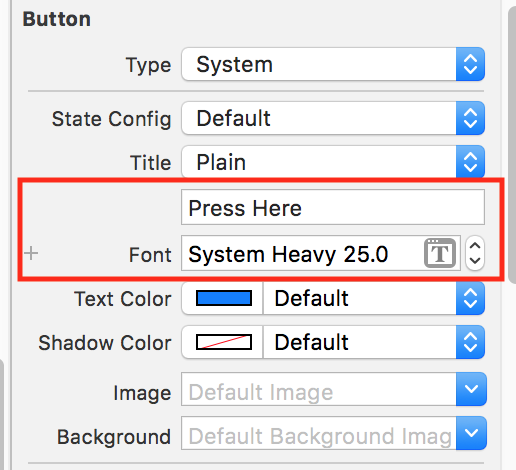
The attributes of button is as follows:


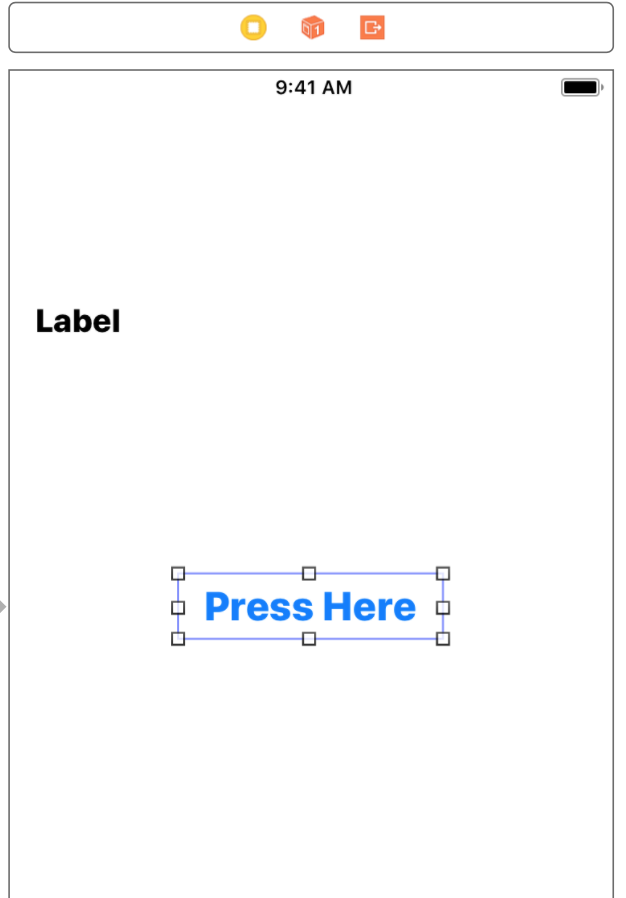
The end result should be as follows:

Linking Label and Button to View Controller

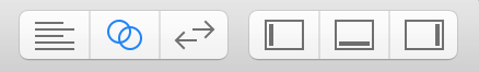
Next, we would like to link the label and button that we created to the view controller. First, Make sure that we are at the storyboard page.  Then we hide the panes. (Note: Pane hiding is optional, it depends user preference) and switch to assistant editor mode.


The resulting screen show be as follows:


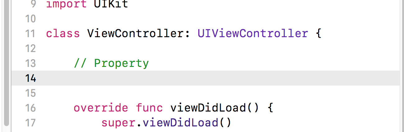
Next, increase the line spacing between the line "class ViewController: UIViewController {" and the next line starting "override func…". If we look at the image above, go to line 12 and increase the line spacing. Add a comment  "// Property" as shown below:


Now, we click ctrl+drag the label to line 14 shown above or just below the property comment.


On release the mouse click, fill in the data as shown below:


Click Connect. The resulting line created should be as follows:


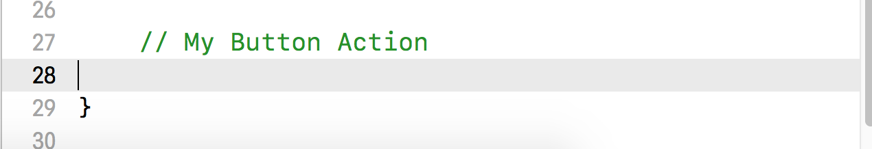
Next, we increase line spacing before the last closing braces. Add the comment My Button Action as shown below.


Next, control and drag the button to line 28 just below the comment. The details show be as follows. Remember to change the connection type from outlets to Action.
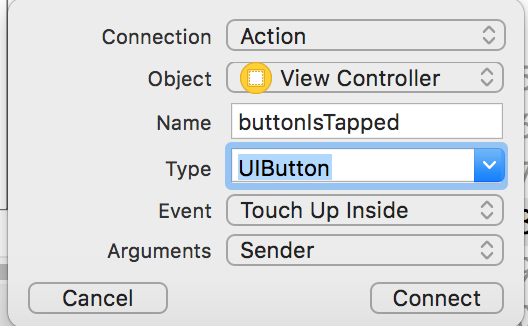


Click Connect.


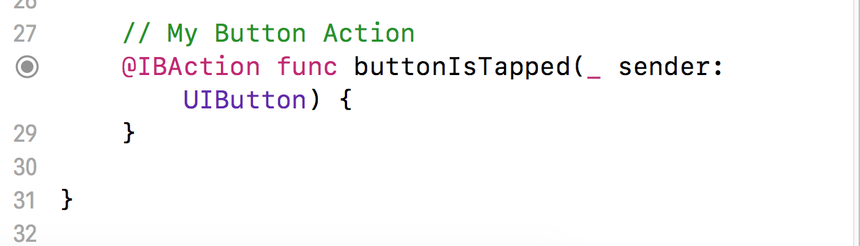
The resulting lines created is as follows:


Finally, we can add instruction to tell the system what to do when the button is tapped. Add the following lines myLabel.text = "The text appear when you tap the button"


The resulting code should be as follows:


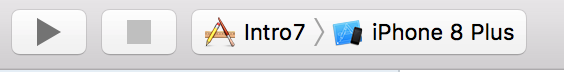
Please note that this is a complete app. We can run the app the clicking on the run icon.


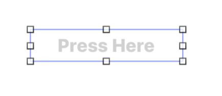
Once the simulator is running, we should see a simulated phone as shown below


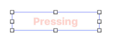
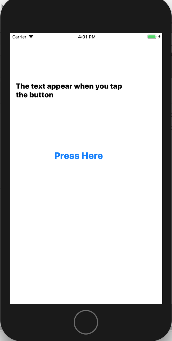
Click on the button and the resulting screen is as below:


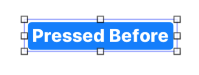
It seems that the text is too long. So we stop the app simulation by clicking on the stop button.


Once the app is stopped, try to increase the vertical height of the label as shown below:


Next we increase the label lines to 2.


Now, when we run the app again, the resulting text will be as follows:

This is the complete process of creating an app with a very basic function.

***

Friday, June 8, 2018

Introduction to iOS Development Series 1.7 - Button

In this section we are going to take a look at the attributes of button. Similarly, create a project named as Intro6.


Change Button Appearance

Place a button on the storyboard at the center as shown below.


While the button is selected, we can examine the attributes at the attribute inspector.


As usual, we can change the text of the button, including the font size and font color. Furthermore, we can also changed the background color.


First we change the name to "Press Here". Change the font size to 20, style to heavy  and font color to red. The changed attribute should be similar to the screenshot below.


Finally, change the background color to yellow.


The resulting button show be as shown below


Button Attributes

Now let's examine the button attributes. We will be only going through with the important or commonly used attributes.


Button Type

The first attributes reflect the type of button. System type is the default as shown in our earlier exercise.


We can select other types, they are:


  1. System
  2. Detail Disclosure
  3. Info Light
  4. Info Dark
  5. Add Contact
  6. Custom


Details Disclosure, Info Light and Info Dark shows the same type of image as shown below:


We will not explore the differences since it is seldom used.


Add Contact type provide different icon image as below


The frequently used types are the system and custom type.


State Config

State Config allow us to set the attribution for when the button is in different state.


The button control have the following state:
  • Default - status when program start
  • Highlighted - when user is tapping the button
  • Selected - when user has tapped the button
  • Focused - this happen when there is more than one view. Focused state is enabled when the view is in focused.
  • Disabled - self explanatory


However state config only allow us to change settings in default, highlighted, selected and disabled state. Please also note that we are only able to change the text of the button and the text color for different state.


Button Text

This is where we put the text of the button. Please note that we can define different text for different button state.


Font

This is where we set the font, style and size.


Text Color

This is where we change the color of the button text. Please note that we  can define different text color for different button state.


Image and Background

The next section is image.  This section allow us to add an image and we can use such image as button.


In fact, once we add an image to the button, the button type will change to custom instead of system.


Control Section


The control section allow us to set the alignment of the button.
The state section shows that the button is at enabled state. We can set the button to selected state or highlighted state  at the beginning but usually we let user interact with the button.


View Section


Content Mode
If we use custom image as button, sometime the aspect ratio of the image does not match button size, we use scale to fill or scale to fit to adjust the image.


Interaction
Make sure "User Interaction Enabled" is checked, otherwise, there will be no response when user pressed the button.


The rest of the attributes are pretty standard. We will make use of such attribute when necessary.


Changing State

Now we can experiment with different state. Please note that only button text and text color is effective. Remove the background color.


First confirm that the default state is as follows:


Next we set highlighted state as follows:


For selected state:


Now we change the effect by checking and unchecking the state


First at default and enabled state, the button is as follows:


Uncheck enabled. At disabled state, this is what happen to the button


Now we checked enabled and highlighted.


Please note that the text will only appear at the moment we tapped the button.


For enabled and selected state


Please note that while running an app, only default and highlighted state will toggle the change. For selected state, we must enabled them programmatically when user tapped the button.


Customize Button

In this section, we will demonstrate the use of customize button with custom image.


First, we need an image. We have chosen the star image.


Similar image can be found from google images.


On the same project, select the asset folder as shown below


At the lower right corner, click on the + button.


Select New Image Set


Once new image set is selected. The following folder will appear. We rename the folder to buttonImage.


Next, we drag and drop our image to the 2x box.


On the same project, we place another button on the storyboard.


At the attribute page, click on the image attribute. On the drop down list box you should see the label buttonImage. Select buttonImage.


The button will become the image and the type will automatically set to custom.


We almost complete series 1. In the last section, we will combined our basic knowledge and create a working app.

***